Role
Logo designer
Motion designer
Logo designer
Motion designer
Leo AI helps remove friction behind the scenes in Streamline, by surfacing answers,
streamlining workflows, and connecting information across their vacation rental businesses.
Leo AI helps remove friction behind the scenes in Streamline, by surfacing answers,
streamlining workflows, and connecting information across their vacation rental businesses.
Leo AI helps remove friction
behind the scenes in Streamline, by surfacing answers, streamlining workflows,
and connecting information across their vacation rental businesses.

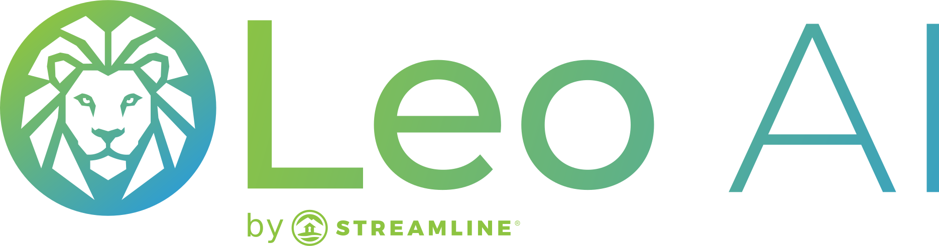
With "Leo" being the latin word for "Lion" the Streamline team wanted us to find a way to incorporate
a lion into the logo design. On the left is a circular icon featuring a stylized, geometric lion's
head/mane, rendered in angular, faceted line-art style using a gradient from green (top-left)
to teal/blue (bottom-right). The lion has a minimalist, symmetrical face with pointed mane sections
radiating outward, all contained within a matching gradient-outlined circle.
To the right of the icon is the wordmark "Leo AI" in a clean, modern sans-serif font. "Leo" is written
in lowercase-style letters (with a capital L) using the same green-to-teal gradient as the icon,
while "AI" is set in all-caps in a solid teal/blue color, visually separating it slightly from "Leo"
to emphasize the AI branding.
Overall, the logo has a clean, tech-forward feel with an approachable icon, paired with
bold AI branding, suggesting strength, intelligence, and reliability.
With "Leo" being the latin word for "Lion" the Streamline team wanted us to find a way to incorporate a lion into the logo design. On the left is a circular icon featuring a stylized, geometric lion's head/mane, rendered in angular, faceted line-art style using a gradient from green (top-left) to teal/blue (bottom-right). The lion has a minimalist, symmetrical face with pointed mane sections radiating outward, all contained within a matching gradient-outlined circle. To the right of the icon is the word mark "Leo AI" in a clean, modern sans-serif font. "Leo" is written in lowercase-style letters (with a capital L) using the same green-to-teal gradient as the icon, while "AI" is set in all-caps in a solid teal/blue color, visually separating it slightly from "Leo" to emphasize the AI branding.
Overall, the logo has a clean, tech-forward feel with an approachable icon, paired with bold AI branding,
suggesting strength, intelligence, and reliability.
With "Leo" being the latin word for "Lion" the Streamline team wanted us to find a way to incorporate a lion into the logo design. On the left is a circular icon featuring a stylized, geometric lion's head/mane, rendered in angular, faceted line-art style using a gradient from green (top-left) to teal/blue (bottom-right). The lion has a minimalist, symmetrical face with pointed mane sections radiating outward, all contained within a matching gradient-outlined circle. To the right of the icon is the word mark "Leo AI" in a clean, modern sans-serif font. "Leo" is written in lowercase-style letters (with a capital L) using the same green-to-teal gradient as the icon, while "AI" is set in all-caps in a solid teal/blue color, visually separating it slightly from "Leo" to emphasize the AI branding.
Overall, the logo has a clean, tech-forward feel with an approachable icon, paired with bold AI branding,
suggesting strength, intelligence, and reliability.
With "Leo" being the latin word for "Lion" the Streamline team wanted us to find a way to incorporate a lion into the logo design. On the left is a circular icon featuring a stylized, geometric lion's head/mane, rendered in angular, faceted line-art style using a gradient from green (top-left) to teal/blue (bottom-right). The lion has a minimalist, symmetrical face with pointed mane sections radiating outward, all contained within a matching gradient-outlined circle. To the right of the icon is the word mark "Leo AI" in a clean, modern sans-serif font. "Leo" is written in lowercase-style letters (with a capital L) using the same green-to-teal gradient as the icon, while "AI" is set in all-caps in a solid teal/blue color, visually separating it slightly from "Leo" to emphasize the AI branding.
Overall, the logo has a clean, tech-forward feel with an approachable icon, paired with
bold AI branding, suggesting strength, intelligence, and reliability.
Logo Process
Logo Process
Social Graphics
Social Graphics
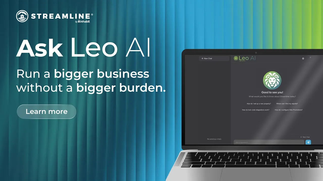
The social graphics for this project function as promotional content for Leo AI.
The social graphics for this project function as promotional content for Leo AI.
The social graphics for this project
function as promotional content for Leo AI.

Promotional Video
When it came to the promotional video, I wanted to make it as tech-forward as possible, while stayingtrue to what Leo AI is. I worked with product to source images of the platform, recreated the platform inAdobe Illustrator, and then animated frames inside of Adobe After Effects, bringing life
to the product.
When it came to the promotional video, I wanted to make it as tech-forward as possible,
while stayingtrue to what Leo AI is. I worked with product to source images of the platform, recreated the platform inAdobe Illustrator, and then animated frames inside of
Adobe After Effects, bringing life to the product.
When it came to the promotional video, I wanted to make it as tech-forward as possible,
while stayingtrue to what Leo AI is. I worked with product to source images of the platform, recreated the platform inAdobe Illustrator, and then animated frames inside of
Adobe After Effects, bringing life to the product.
When it came to the promotional video, I wanted to make it as tech-forward as possible,
while staying true to what Leo AI is. I worked with product to source images of the platform, recreated the platform in Adobe Illustrator, and then animated frames inside of
Adobe After Effects, bringing life to the product.