Role
Role
Role
Logo designer
Motion designer
Logo designer
Motion designer
Logo designer
Motion designer
Contributors
Contributors
Contributors
Andrew Shaw
Bruno Reinbold
Luis Pastor
David Low
Andrew Shaw
Bruno Reinbold
Luis Pastor
David Low
Andrew Shaw
Bruno Reinbold
Luis Pastor
David Low
In August of 2022, the Talkwalker marketing team was given the
task of drafting up the Social Media Trends for Q1 of 2023.
The report would be sent out through email and released on Linkedin,
Twitter (now X), Instagram, and Facebook. The design team was
tasked with branding the report and creating promotional material.
In August of 2022, the Talkwalker marketing team was given the
task of drafting up the Social Media Trends for Q1 of 2023.
The report would be sent out through email and released on Linkedin,
Twitter (now X), Instagram, and Facebook. The design team was
tasked with branding the report and creating promotional material.
In August of 2022, the Talkwalker marketing team was given the
task of drafting up the Social Media Trends for Q1 of 2023.
The report would be sent out through email and released on Linkedin,
Twitter (now X), Instagram, and Facebook. The design team was
tasked with branding the report and creating promotional material.

Logo Process
For this project, the main objective was to find
a way to illustrate the connection between the brand to the consumer. This was achieved by turning the "S" into three separate shapes. The top of shape representing the consumer, the bottom shape representing the brand, and the middle shape representing the connection between
the two. This "S" shape would become the letter mark for the campaign.
For this project, the main objective was to find a way to illustrate the connection between the brand to the consumer. This was achieved by turning the "S" into three separate shapes. The top of shape representing the consumer, the bottom shape representing the brand, and the middle shape representing the connection between the two. This "S" shape would become the letter mark for the campaign.

Logo Process
For this project, the main objective was to find a way to illustrate the connection between the brand to the consumer. This was achieved by turning the "S" into three separate shapes. The top of shape representing the consumer, the bottom shape representing the brand, and the middle shape representing the connection between
the two. This "S" shape would become the
letter mark for the campaign.
Logo Process
For this project, the main objective was to find a way to illustrate the connection between the brand to
the consumer. This was achieved by turning the "S" into three separate shapes. The top of shape representing the consumer, the bottom shape representing the brand, and the middle shape representing the connection between the two. This "S" shape would become the letter mark
for the campaign.


Social Graphics
Social Graphics
These graphics were designed as part of the broader
2023 Social Media Trends campaign, extending the visual system into
organic social content across Instagram, X, and Facebook. The first pulls
a key stat from the report, turning editorial content into a shareable,
quote-style card. The second promotes a live UK webinar, functioning
as an event announcement with speaker headshots, date/time, and a clear
visual hierarchy that leads with the session title and works down to credentials.
These graphics were designed as part of the broader
2023 Social Media Trends campaign, extending the visual system into
organic social content across Instagram, X, and Facebook. The first pulls
a key stat from the report, turning editorial content into a shareable,
quote-style card. The second promotes a live UK webinar, functioning
as an event announcement with speaker headshots, date/time, and a clear
visual hierarchy that leads with the session title and works down to credentials.
These graphics were designed as part of the broader 2023 Social Media Trends campaign, extending the visual system into organic social content across Instagram, X, and Facebook. The first pulls
a key stat from the report, turning editorial content into a shareable,
quote-style card. The second promotes a live UK webinar, functioning as an event announcement with speaker headshots, date/time, and a clear
visual hierarchy that leads with the session title and
works down to credentials.


Email Graphics
Email Graphics
This project involved designing three email signature banners to promote
the Talkwalker and Khoros 2023 Social Media Trends report, built as a
cohesive system for A/B/C testing or segmented deployment.
All three share consistent brand elements — co-logos, the report logotype,
headline copy, and a CTA button — while each explores a distinct visual direction:
V1 leads with multiple faces in a blue/pink duotone for human warmth;
V2 uses a tight editorial crop for a more abstract, magazine-inspired mood;
V3 strips photography entirely in favor of bold color blocking, ensuring the design
holds up even when images are disabled in email clients.
This project involved designing three email signature banners to promote
the Talkwalker and Khoros 2023 Social Media Trends report, built as a
cohesive system for A/B/C testing or segmented deployment.
All three share consistent brand elements — co-logos, the report logotype,
headline copy, and a CTA button — while each explores a distinct visual direction: V1 leads with multiple faces in a blue/pink duotone for human warmth; V2 uses a tight editorial crop for a more abstract,
magazine-inspired mood; V3 strips photography entirely in favor of bold color blocking, ensuring the design holds up even when
images are disabled in email clients.
This project involved designing three email signature banners to promote
the Talkwalker and Khoros 2023 Social Media Trends report, built as a
cohesive system for A/B/C testing or segmented deployment.
All three share consistent brand elements — co-logos, the report logotype, headline copy, and a CTA button — while each explores a distinct visual direction: V1 leads with multiple faces in a blue/pink duotone for human warmth; V2 uses a tight editorial crop for a more abstract,
magazine-inspired mood; V3 strips photography entirely in favor of bold color blocking, ensuring the design holds up even when images are disabled in email clients.
Promotional Video
Promotional Video
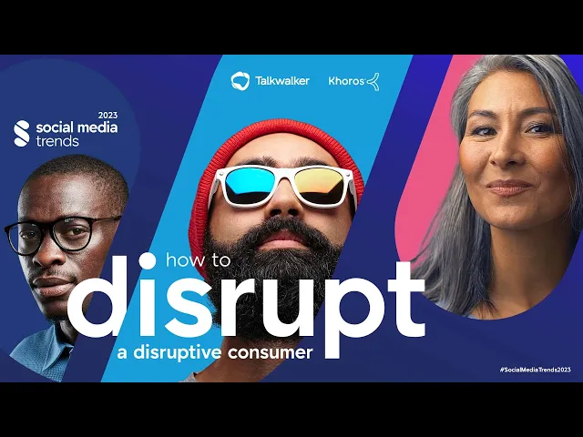
When it came to creating the video, I wanted the shapes from the "S" to be
the main element used throughout.The report graphics featured photos of
people integrated into the "S" shapes, so I mirrored this approach by using
the lettermark as a mask in Adobe After Effects. I then layered it over footage
of people engaging with technology and interacting with each other.
When it came to creating the video, I wanted the shapes from the "S" to be
the main element used throughout.The report graphics featured photos of
people integrated into the "S" shapes, so I mirrored this approach by using
the lettermark as a mask in Adobe After Effects. I then layered it over footage
of people engaging with technology and interacting with each other.
When it came to creating the video, I wanted the shapes from the "S" to be
the main element used throughout.The report graphics featured photos of people integrated into the "S" shapes, so I mirrored this approach by using the lettermark as a mask in Adobe After Effects. I then layered it over footage of people engaging with technology and interacting with each other.